BuildWithMatija
  1. Home
  2. Blog
  3. Tools
  4. Remotion Tutorial: Build an Animated Video with React and TypeScript

Remotion Tutorial: Build an Animated Video with React and TypeScript

1st October 2026·Updated on:6th October 2026·MŽMatija Žiberna·
Tools
Remotion Tutorial: Build an Animated Video with React and TypeScript

📚 Get Practical Development Guides

Join developers getting comprehensive guides, code examples, optimization tips, and time-saving prompts to accelerate their development workflow.

No spam. Unsubscribe anytime.

📄View markdown version
0

Comments

About the author

Matija Žiberna

Matija Žiberna

Full-stack developer, co-founder

AboutResume

Self-taught full-stack developer sharing lessons from building software and startups.

I'm Matija Žiberna, a self-taught full-stack developer and co-founder passionate about building products, writing clean code, and figuring out how to turn ideas into businesses. I write about web development with Next.js, lessons from entrepreneurship, and the journey of learning by doing. My goal is to provide value through code—whether it's through tools, content, or real-world software.

Contents

  • 1. Understand what Remotion renders
  • 2. Create an isolated video project
  • Configure TypeScript and Tailwind
  • Prepare the images and fonts
  • 3. Register the entrypoint and compositions
  • 4. Create the shared animation and layout components
  • Imports, colors, and layout detection
  • Wait for bundled fonts
  • Badges and staggered entrances
  • Scene framing and headings
  • Persistent background and branding
  • 5. Build the five scenes
  • Scene 1: title and hook
  • Scene 2: compare access defaults
  • Scene 3: relationship depth
  • Scene 4: framework adapters and the shared core
  • Scene 5: hold the call to action
  • 6. Assemble the timeline
  • 7. Preview the result in Studio
  • 8. Render MP4, WebM, and posters
  • 9. Adapt the example to your own content
  • 10. Troubleshoot the common failures
  • A component or import cannot be found
  • Utility classes have no effect
  • Fonts fail to load or the render times out
  • Animation looks different after scrubbing
  • Square content clips or collides with the footer
  • The final export is unreadable or fails
  • Where to go after this tutorial
On this page:
  • 1. Understand what Remotion renders
  • 2. Create an isolated video project
  • 3. Register the entrypoint and compositions
  • 4. Create the shared animation and layout components
  • 5. Build the five scenes
Build with Matija logo

Build with Matija

Senior-led B2B websites, applications, content systems, and digital infrastructure. Business-first, full-stack, AI-assisted, no handoffs.

Services

  • B2B Website Development
  • CMS Architecture Review & Platform Blueprint
  • Next.js + Payload Advisory
  • AI Integration & Implementation

Resources

  • CMS Hub
  • B2B Website Strategy
  • E-commerce Hub
  • Blog
  • Case Studies
  • About Matija

Payload CMS

  • Payload CMS Developer
  • Payload CMS Migration
  • Payload CMS Demos
  • All Payload CMS Resources

Discuss your project

Planning a rebuild, migration, application, workflow change, or platform decision? Start with the business problem and the system behind it.

Book a discovery callContact me →
© 2026Build with Matija•All rights reserved•Privacy Policy•Terms of Service
BuildWithMatija
Get In Touch

I wanted to turn an article about Payload CMS 4.0 into a short animated teaser. The content already had useful visual ideas: an access-control comparison, a relationship-depth diagram, and two framework adapters sharing one core. Remotion let me turn those ideas into video using React components, TypeScript, CSS, and SVG.

Here is the finished 15-second video we will recreate:

Your browser cannot play this video. Download the MP4.

By the end, you will have the same five-scene video in two formats: 1920×1080 landscape and 1080×1080 square. You will also understand how Remotion connects a frame number to what appears on screen, how scenes get their own timelines, and how to make fonts and images ready before a frame is captured.

You should be comfortable with React components, hooks, TypeScript, and basic CSS. You do not need a Payload installation: all the Payload content in this example is text and graphics. The canary labels describe the example's subject; this tutorial is about creating its animation.

This is a complete implementation walkthrough. Each application source file appears below. The large component is split into consecutive blocks so we can discuss each part. Copy those blocks into the same file in the order shown.

1. Understand what Remotion renders

Slide Gallery· remotion-pipeline-scenes
1 / 4
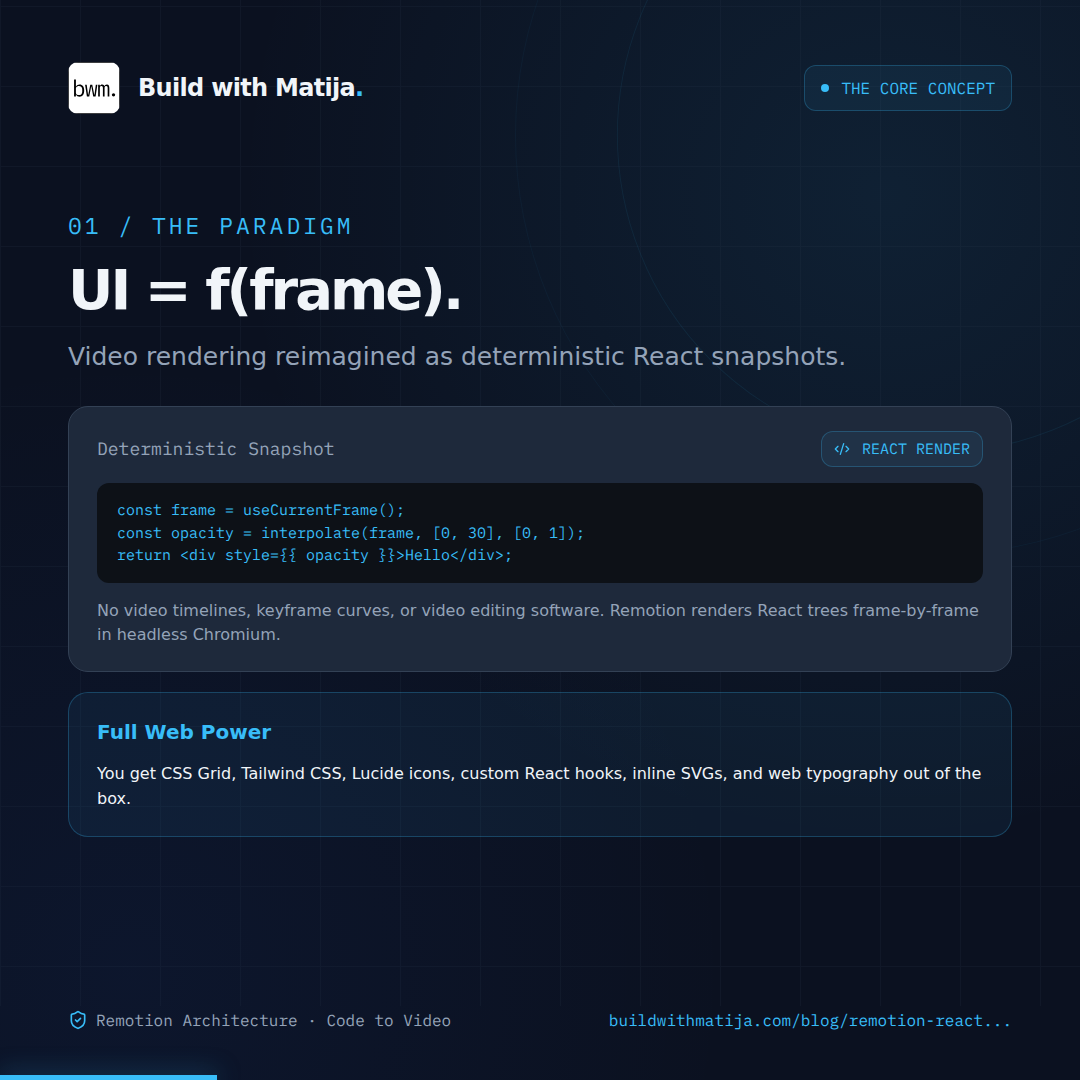
UI = f(frame): The Mental Model: Remotion doesn't use timelines or keyframe tracks; every frame is a deterministic React render at frame N.
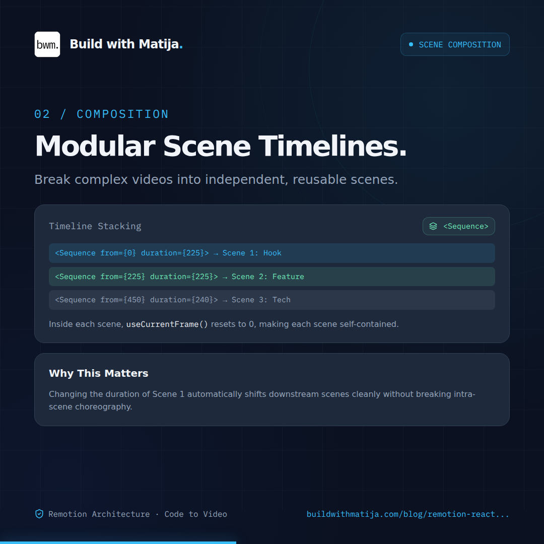
Isolated Timelines with <Sequence>: Break complex animations into modular scene components with localized frame counters.
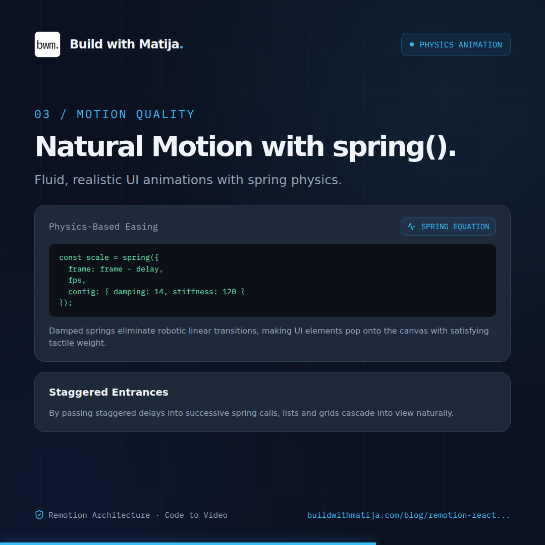
Natural Motion with spring(): Replace rigid linear easing with mass, damping, and stiffness for fluid UI physics.
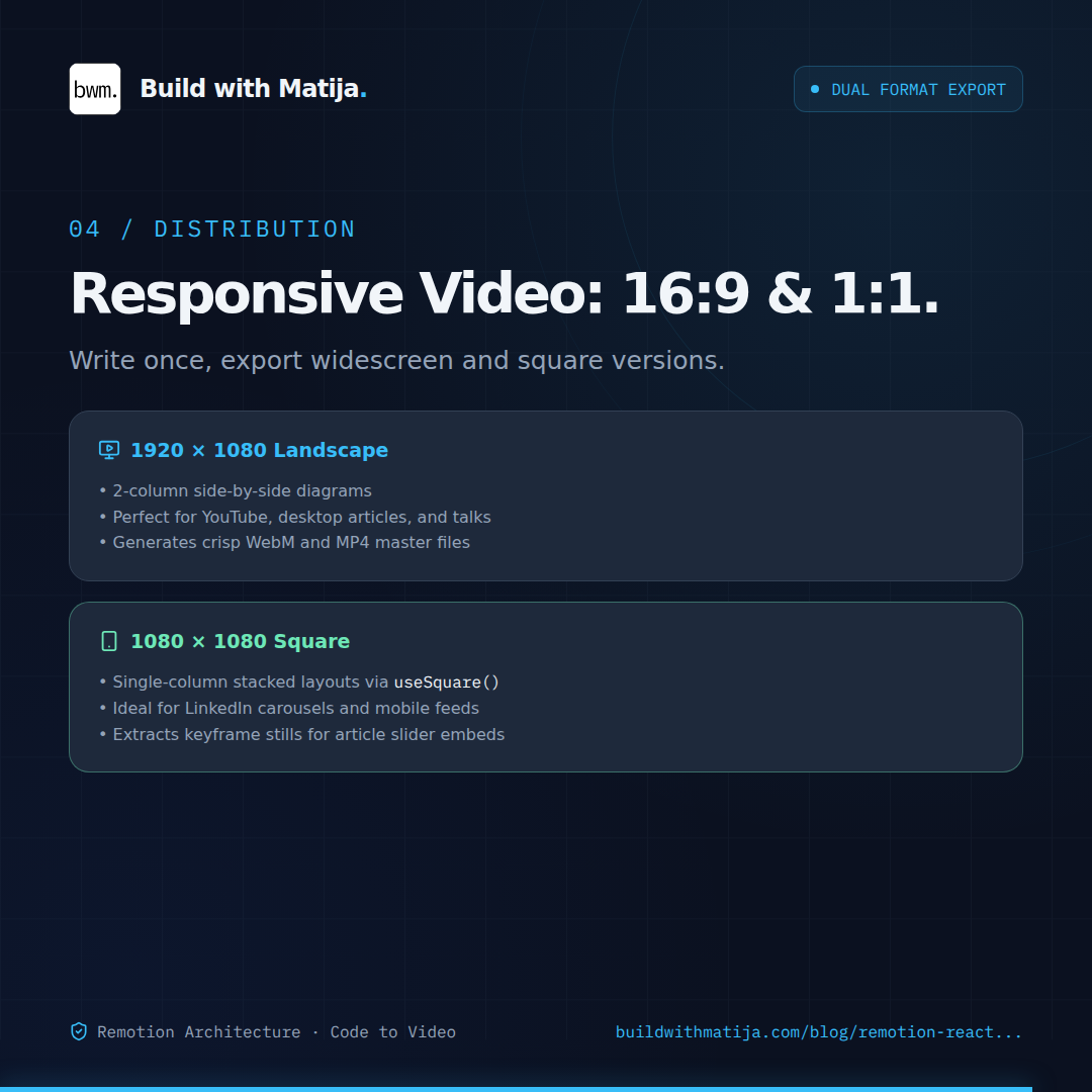
Responsive Video: 16:9 & 1:1: Use responsive layout hooks to render widescreen YouTube video and square social feeds from one component.
UI = f(frame): The Mental Model: Remotion doesn't use timelines or keyframe tracks; every frame is a deterministic React render at frame N.

Think of a composition as a React component with a video-sized canvas and a timeline. Remotion supplies the current frame. Your component calculates positions, opacity, scale, and visible content for that frame.

At 60 frames per second, frame 60 represents one second into the video. Our composition lasts 900 frames, so its duration is 900 / 60 = 15 seconds. Frames are zero-based: the first is 0 and the last is 899.

In Studio, you can scrub directly to a frame and see the component at that point. During a local render, Remotion uses a browser to capture frames and encodes them into a video. The component must therefore produce the right visual even when you jump directly to a later frame.

This changes how you animate. A web page often starts a CSS transition after a click and lets time pass. In a Remotion composition, the current frame determines the animation state. There is no need to play the previous 100 frames to know how frame 101 should look. Remotion explicitly recommends frame-driven animation instead of CSS transitions and keyframes. Read the animation guidance.

Our implementation uses two main tools: interpolate() for mapping progress to visual values, and spring() for entrances with a natural settling motion. Ordinary CSS still handles layout, typography, borders, gradients, and colors.

2. Create an isolated video project

Use Node.js 24 and pnpm 10.33.0 for this walkthrough. Create a fresh directory outside any existing pnpm workspace, so its dependencies and configuration belong to this example:

bash
mkdir remotion-payload-teaser
cd remotion-payload-teaser
mkdir -p src public/fonts out

All following shell commands run from this directory. Create the package file before installing anything. These are the versions used by the reference implementation; keep the Remotion packages on the same exact version.

Create package.json:

json
{
  "name": "bwm-payload-video",
  "version": "1.0.0",
  "private": true,
  "type": "module",
  "packageManager": "pnpm@10.33.0",
  "scripts": {
    "start": "remotion studio src/index.ts --port=3100",
    "render:landscape": "remotion render src/index.ts Payload4Teaser out/payload-4-0-teaser.mp4 --codec=h264 --pixel-format=yuv420p --crf=18 --concurrency=4 --color-space=bt709 --image-format=png",
    "render:square": "remotion render src/index.ts Payload4Square out/payload-4-0-square.mp4 --codec=h264 --pixel-format=yuv420p --crf=18 --concurrency=4 --color-space=bt709 --image-format=png",
    "render:webm": "remotion render src/index.ts Payload4Teaser out/payload-4-0-teaser.webm --codec=vp9 --video-bitrate=6M --concurrency=4 --color-space=bt709 --image-format=png",
    "poster:landscape": "remotion still src/index.ts Payload4Teaser out/payload-4-0-poster.png --frame=150",
    "poster:square": "remotion still src/index.ts Payload4Square out/payload-4-0-square-poster.png --frame=150"
  },
  "dependencies": {
    "remotion": "4.0.532",
    "react": "19.2.4",
    "react-dom": "19.2.4",
    "lucide-react": "0.475.0"
  },
  "devDependencies": {
    "@remotion/cli": "4.0.532",
    "@remotion/tailwind-v4": "4.0.532",
    "@fontsource/inter": "5.3.0",
    "@fontsource/ibm-plex-mono": "5.3.0",
    "@types/react": "19.2.2",
    "@types/react-dom": "19.2.2",
    "typescript": "5.9.3",
    "tailwindcss": "4.2.2",
    "zod": "4.5.4"
  }
}

Install the dependencies:

bash
pnpm install
pnpm exec remotion versions

The first install generates pnpm-lock.yaml. Keep that lockfile with your project. Once it exists, use pnpm install --frozen-lockfile for repeat installations. You do not need to hand-write or copy hundreds of lockfile entries from an article.

React and React DOM render our components. Remotion supplies the timeline primitives. The CLI opens Studio and exports media. Lucide provides SVG icons, the Fontsource packages supply local font files, and the Tailwind integration processes the utility classes used by the layout. Zod is pinned in the reference package; this composition does not define a custom props schema.

The finished project will have this structure:

text
remotion-payload-teaser/
  package.json
  pnpm-lock.yaml                 # generated by pnpm install
  remotion.config.ts
  tsconfig.json
  src/
    index.ts
    Root.tsx
    Payload4Teaser.tsx
    style.css
  public/
    bwm-logo.svg
    author.jpeg
    fonts/
      inter-400.woff2
      inter-500.woff2
      inter-600.woff2
      inter-700.woff2
      plex-mono-400.woff2
      inter-LICENSE.txt
      ibm-plex-mono-LICENSE.txt
  out/                           # generated videos and stills

Configure TypeScript and Tailwind

The TypeScript configuration includes browser types because the font loader uses FontFace and document.fonts. This package is independent of any website's TypeScript configuration.

Create tsconfig.json:

json
{
  "compilerOptions": {
    "target": "ES2022",
    "lib": ["DOM", "ES2022", "DOM.Iterable"],
    "jsx": "react-jsx",
    "module": "ESNext",
    "moduleResolution": "Bundler",
    "strict": true,
    "esModuleInterop": true,
    "skipLibCheck": true,
    "noEmit": true
  },
  "include": ["src", "remotion.config.ts"]
}

Tailwind v4 needs a bundler integration in this project. Installing Tailwind alone does not make the classes in our components work. Use Remotion's enableTailwind() override. The overwrite setting allows subsequent exports to replace the same output filename. See the official integration.

Create remotion.config.ts:

ts
import { Config } from "@remotion/cli/config";
import { enableTailwind } from "@remotion/tailwind-v4";

Config.overrideWebpackConfig((config) => enableTailwind(config));
Config.setOverwriteOutput(true);

The stylesheet imports Tailwind, points source scanning at this directory, and uses border-box sizing. It contains no time-based CSS animation.

Create src/style.css:

css
@import "tailwindcss";
@source './';

* {
  box-sizing: border-box;
}

Prepare the images and fonts

Download the example logo and author portrait into public/, keeping their filenames. These are the assets shown in the video. For your own video, replace them with your branding.

On macOS or Linux, you can download them from the site with:

bash
curl --fail --location https://buildwithmatija.com/remotion-guide/assets/bwm-logo.svg --output public/bwm-logo.svg
curl --fail --location https://buildwithmatija.com/remotion-guide/assets/author.jpeg --output public/author.jpeg

Copy the font files from the packages you just installed, and rename them to match the paths our component will request:

bash
for weight in 400 500 600 700; do
  cp "node_modules/@fontsource/inter/files/inter-latin-${weight}-normal.woff2" "public/fonts/inter-${weight}.woff2"
done
cp node_modules/@fontsource/ibm-plex-mono/files/ibm-plex-mono-latin-400-normal.woff2 public/fonts/plex-mono-400.woff2
cp node_modules/@fontsource/inter/LICENSE public/fonts/inter-LICENSE.txt
cp node_modules/@fontsource/ibm-plex-mono/LICENSE public/fonts/ibm-plex-mono-LICENSE.txt

The Latin subset covers the example's text. If you adapt it to another writing system, select a font subset that includes those characters.

Remotion's staticFile() resolves assets from the project's public/ directory. We will use it for both the images and fonts, rather than relying on a website-relative URL. See staticFile().

3. Register the entrypoint and compositions

The CLI needs an entrypoint that registers our root component.

Create src/index.ts:

ts
import { registerRoot } from "remotion";
import { RemotionRoot } from "./Root";

registerRoot(RemotionRoot);

The root registers two compositions. Each points to the same React component, but supplies different canvas dimensions. The IDs are what the render scripts select. See the composition API.

Create src/Root.tsx:

tsx
import { Composition } from "remotion";
import { Payload4Teaser } from "./Payload4Teaser";

export const RemotionRoot = () => {
  return (
    <>
      <Composition
        id="Payload4Teaser"
        component={Payload4Teaser}
        durationInFrames={900}
        fps={60}
        width={1920}
        height={1080}
        defaultProps={{
          title: "Payload CMS 4.0: Breaking Changes & Canary Deep Dive",
          slug: "payload-4-0",
        }}
      />
      <Composition
        id="Payload4Square"
        component={Payload4Teaser}
        durationInFrames={900}
        fps={60}
        width={1080}
        height={1080}
        defaultProps={{
          title: "Payload CMS 4.0: Breaking Changes & Canary Deep Dive",
          slug: "payload-4-0",
        }}
      />
    </>
  );
};

Both compositions run at 60 fps for 900 frames. The square video is a different layout of the same content, rather than a center crop of the landscape export.

defaultProps supplies the title for the opening scene and the article slug for the closing URL. These props do not make every scene generic: the access-control diagrams and other Payload-specific text remain in the component.

Root.tsx imports Payload4Teaser, which we create next. Wait until the final component is assembled before opening Studio.

4. Create the shared animation and layout components

Create src/Payload4Teaser.tsx. Copy every TSX block from this section through section 6 into this one file, in order. Each block adds new declarations; it does not replace the previous block. Together they are the complete source.

Imports, colors, and layout detection

Start the file with all imports and the shared constants:

tsx
import { useEffect, useState, type CSSProperties, type ReactNode } from "react";
import {
  AbsoluteFill,
  Img,
  Sequence,
  continueRender,
  delayRender,
  cancelRender,
  interpolate,
  spring,
  staticFile,
  useCurrentFrame,
  useVideoConfig,
} from "remotion";
import {
  ArrowRight,
  ArrowUpRight,
  Code2,
  Database,
  GitBranch,
  LockKeyhole,
  ShieldCheck,
  Sparkles,
  Terminal,
  Users,
  Workflow,
} from "lucide-react";
import "./style.css";

export type TeaserProps = { title: string; slug: string };
const C = {
  bg: "#0b1120",
  card: "#1e293b",
  sky: "#38bdf8",
  text: "#f1f5f9",
  muted: "#94a3b8",
  red: "#fb7185",
  green: "#6ee7b7",
  border: "#334155",
};
const mono: CSSProperties = { fontFamily: "IBM Plex Mono, monospace" };
const clamp = { extrapolateLeft: "clamp", extrapolateRight: "clamp" } as const;
const useSquare = () => {
  const { width, height } = useVideoConfig();
  return width === height;
};

C centralizes the palette. mono gives code and labels a consistent font. clamp prevents interpolation from continuing beyond its intended endpoints. The useSquare() hook reads the composition dimensions; it does not use the browser window's size.

That distinction matters when the same composition is previewed at different zoom levels. A 1080×1080 canvas stays square even if Studio shows it inside a wide browser window.

Wait for bundled fonts

Append the font gate:

tsx
const FontGate = () => {
  const [handle] = useState(() => delayRender("Loading bundled typography"));
  useEffect(() => {
    let active = true;
    Promise.all(
      [
        ...[400, 500, 600, 700].map(
          (weight) =>
            new FontFace(
              "Inter",
              `url("${staticFile(`fonts/inter-${weight}.woff2`)}")`,
              { weight: String(weight) },
            ),
        ),
        new FontFace(
          "IBM Plex Mono",
          `url("${staticFile("fonts/plex-mono-400.woff2")}")`,
          { weight: "400" },
        ),
      ].map(async (font) => {
        const loaded = await font.load();
        document.fonts.add(loaded);
      }),
    )
      .then(() => {
        if (active) continueRender(handle);
      })
      .catch(cancelRender);
    return () => {
      active = false;
    };
  }, [handle]);
  return null;
};

The gate creates a render-delay handle once for the mounted component. It loads the required weights, registers them with the browser, and clears the handle when all fonts are ready. A load failure calls cancelRender, so an export fails rather than silently capturing fallback typography. See the render-delay lifecycle.

The component renders nothing visible. Its purpose is to coordinate readiness. Loading the typefaces matters because fallback fonts can change text widths, line breaks, and diagram spacing.

The cleanup flag prevents a completed request from continuing a render after this instance has unmounted. For a larger application, Remotion also provides font-loading utilities; here we retain the small FontFace implementation used by the reference video. Read the font guide.

Badges and staggered entrances

Append the badge component:

tsx
const Badge = ({
  children,
  color = C.sky,
  style,
}: {
  children: ReactNode;
  color?: string;
  style?: CSSProperties;
}) => (
  <div
    style={{
      ...mono,
      display: "inline-flex",
      alignItems: "center",
      gap: 12,
      padding: "12px 18px",
      fontSize: 22,
      color,
      background: `${color}10`,
      border: `1px solid ${color}40`,
      borderRadius: 12,
      whiteSpace: "nowrap",
      ...style,
    }}
  >
    {children}
  </div>
);

A badge is ordinary JSX and CSS. Its children can be text, an icon, or both. The same primitive styles the opening tags and the canary indicator.

Now append the entrance animation:

tsx
const Pop = ({
  children,
  delay = 0,
  style,
}: {
  children: ReactNode;
  delay?: number;
  style?: CSSProperties;
}) => {
  const frame = useCurrentFrame();
  const { fps } = useVideoConfig();
  const progress = spring({
    frame: frame - delay,
    fps,
    config: { damping: 22, stiffness: 120, mass: 0.8 },
  });
  return (
    <div
      style={{
        opacity: interpolate(frame - delay, [-8, 16], [0, 1], clamp),
        transform: `translateY(${(1 - progress) * 28}px) scale(${0.97 + progress * 0.03})`,
        ...style,
      }}
    >
      {children}
    </div>
  );
};

Pop combines two drivers. A spring moves the element from 28 pixels below its resting position and scales it from roughly 0.97 toward 1. Interpolation controls opacity. delay shifts both calculations, allowing a heading, subtitle, and badges to enter in succession.

The spring receives the composition's fps; the damping, stiffness, and mass values tune how it settles. The frame passed to it is frame - delay, so each element uses the same entrance with a different start. See the spring API.

There is a subtle detail in the opacity curve: it maps [-8, 16] to [0, 1]. That starts fading eight frames before the spring's nominal start and reaches full opacity sixteen frames after it. delay therefore does not mean completely invisible until that exact frame.

Clamping keeps opacity within the chosen range before and after the animation interval. Without clamping, interpolation continues along the line beyond its endpoints. See interpolation and extrapolation.

Scene framing and headings

Append the shared scene wrapper:

tsx
const Scene = ({
  children,
  duration = 180,
  hold = false,
}: {
  children: ReactNode;
  duration?: number;
  hold?: boolean;
}) => {
  const frame = useCurrentFrame();
  const sq = useSquare();
  return (
    <AbsoluteFill
      style={{
        padding: sq ? "208px 68px 140px" : "220px 112px 140px",
        opacity: interpolate(
          frame,
          [0, 16, duration - 13, duration - 1],
          [0.35, 1, 1, hold ? 1 : 0.35],
          clamp,
        ),
        transform: `translateY(${interpolate(frame, [0, 24, duration - 13, duration - 1], [14, 0, 0, hold ? 0 : -8], clamp)}px)`,
      }}
    >
      {children}
    </AbsoluteFill>
  );
};

AbsoluteFill covers the composition. The wrapper supplies padding, a short entrance, and a short exit based on the scene's local frame. Its default duration is 180 frames; the longer access scene and shorter depth scene pass explicit durations.

This example fades between opacity 0.35 and 1, rather than fading completely to black. The final scene uses hold to keep its end state visible. These are design choices you can change by adjusting the output ranges.

Append the shared heading:

tsx
const Heading = ({
  index,
  eyebrow,
  children,
  subtitle,
}: {
  index: string;
  eyebrow: string;
  children: ReactNode;
  subtitle?: ReactNode;
}) => {
  const sq = useSquare();
  return (
    <div style={{ marginBottom: sq ? 30 : 42 }}>
      <div
        style={{
          ...mono,
          color: C.sky,
          fontSize: 23,
          letterSpacing: 3,
          textTransform: "uppercase",
          marginBottom: 16,
        }}
      >
        {index} / {eyebrow}
      </div>
      <h1
        style={{
          fontSize: sq ? 56 : 76,
          fontWeight: 600,
          letterSpacing: -3,
          lineHeight: 1.1,
          margin: 0,
        }}
      >
        {children}
      </h1>
      {subtitle && (
        <div
          style={{
            fontSize: sq ? 25 : 28,
            color: C.muted,
            lineHeight: 1.5,
            marginTop: 18,
          }}
        >
          {subtitle}
        </div>
      )}
    </div>
  );
};

The heading changes font sizes and spacing for the square composition. ReactNode lets subtitles contain either plain text or JSX, such as a highlighted value.

Persistent background and branding

Append the background:

tsx
const Background = () => {
  const frame = useCurrentFrame();
  const { width } = useVideoConfig();
  return (
    <AbsoluteFill style={{ background: C.bg, overflow: "hidden" }}>
      <AbsoluteFill
        style={{
          background:
            "radial-gradient(ellipse at 82% 18%, #38bdf817 0%, transparent 52%), radial-gradient(ellipse at 12% 90%, #2563eb10 0%, transparent 45%)",
        }}
      />
      <AbsoluteFill
        style={{
          opacity: 0.15,
          backgroundImage:
            "linear-gradient(#334155 1px, transparent 1px), linear-gradient(90deg, #334155 1px, transparent 1px)",
          backgroundSize: "80px 80px",
          transform: `translateY(${(frame / 30) % 80}px)`,
          top: -80,
          bottom: -80,
        }}
      />
      <div
        style={{
          position: "absolute",
          width: 630,
          height: 630,
          border: "1px solid #38bdf814",
          borderRadius: "50%",
          right: -170,
          top: -180,
          transform: `scale(${1 + frame / 18000})`,
        }}
      />
      <div
        style={{
          position: "absolute",
          width: 840,
          height: 840,
          border: "1px solid #38bdf80b",
          borderRadius: "50%",
          right: -275,
          top: -285,
        }}
      />
      <div
        style={{
          position: "absolute",
          bottom: 0,
          left: 0,
          height: 5,
          width: (width * (frame + 1)) / 900,
          background: C.sky,
          boxShadow: "0 0 24px #38bdf880",
        }}
      />
    </AbsoluteFill>
  );
};

The gradient, grid, rings, and progress bar remain behind every scene. Their movement comes from the current frame. The grid translates using a repeating calculation, and the large ring slowly scales.

The progress bar uses (frame + 1) / 900, so it reaches full width on the last frame, 899. The denominator is deliberately tied to this video's fixed duration. If you change the composition length, update it too, or derive it from useVideoConfig().

Append the brand overlay:

tsx
const Brand = () => {
  const sq = useSquare();
  const frame = useCurrentFrame();
  const chapter =
    frame < 180
      ? "THE V4 BREAKDOWN"
      : frame < 420
        ? "SECURITY DEFAULTS"
        : frame < 540
          ? "QUERY DEPTH"
          : frame < 720
            ? "FRAMEWORK ADAPTERS"
            : "THE FULL GUIDE";
  return (
    <>
      <div
        className="flex items-center justify-between"
        style={{
          position: "absolute",
          top: sq ? 66 : 64,
          left: sq ? 68 : 112,
          right: sq ? 68 : 112,
          height: 64,
        }}
      >
        <div className="flex items-center" style={{ gap: 18 }}>
          <Img
            src={staticFile("bwm-logo.svg")}
            style={{ width: 54, height: 54, borderRadius: 9 }}
          />
          <div
            style={{
              fontSize: sq ? 24 : 26,
              letterSpacing: -0.7,
              fontWeight: 600,
            }}
          >
            Build with Matija<span style={{ color: C.sky }}>.</span>
          </div>
        </div>
        <Badge style={{ fontSize: sq ? 17 : 19, padding: "10px 14px" }}>
          <span
            style={{
              width: 7,
              height: 7,
              borderRadius: "50%",
              background: C.sky,
            }}
          />
          V4 CANARY
        </Badge>
      </div>
      <div
        style={{
          position: "absolute",
          bottom: 56,
          left: sq ? 68 : 112,
          right: sq ? 68 : 112,
          display: "flex",
          justifyContent: "space-between",
          color: C.muted,
          ...mono,
          fontSize: sq ? 17 : 20,
          letterSpacing: 1.2,
        }}
      >
        <span>{chapter}</span>
        <span>buildwithmatija.com</span>
      </div>
    </>
  );
};

The chapter labels switch at the same frame boundaries we will use for the scenes. The logo, canary badge, chapter label, and website address stay visible across the whole timeline.

We will place Background and Brand outside the sequences. They therefore receive the composition's frame, while the scene components inside a sequence receive a local frame. That lets the background stay continuous while each scene starts its own entrance at zero.

5. Build the five scenes

Continue appending these blocks to src/Payload4Teaser.tsx. We are now composing the shared primitives into the exact content shown in the video.

Scene 1: title and hook

Append the opening scene:

tsx
const Hook = ({ title }: { title: string }) => {
  const sq = useSquare();
  const separator = title.indexOf(":");
  const headline = separator < 0 ? title : title.slice(0, separator);
  const subtitle =
    separator < 0
      ? "Breaking Changes & Canary Deep Dive"
      : title.slice(separator + 1).trim();
  return (
    <Scene>
      <Pop>
        <div
          style={{
            ...mono,
            fontSize: 23,
            color: C.sky,
            letterSpacing: 3,
            marginBottom: sq ? 36 : 34,
          }}
        >
          ARCHITECTURE / MIGRATION / WHAT’S NEXT
        </div>
      </Pop>
      <Pop delay={8}>
        <h1
          style={{
            fontSize: sq ? 104 : 146,
            lineHeight: 1.06,
            fontWeight: 600,
            letterSpacing: sq ? -6 : -8,
            margin: 0,
            maxWidth: sq ? 900 : 1600,
          }}
        >
          {headline.replace(" 4.0", "")}
          <br />
          <span style={{ color: C.sky }}>4.0</span>
          <span
            style={{
              fontSize: sq ? 27 : 32,
              letterSpacing: 0,
              color: C.muted,
              marginLeft: 28,
              verticalAlign: "middle",
              ...mono,
            }}
          >
            THE NEXT CHAPTER
          </span>
        </h1>
      </Pop>
      <Pop delay={20}>
        <div
          style={{
            fontSize: sq ? 40 : 49,
            lineHeight: 1.25,
            fontWeight: 500,
            letterSpacing: -1.3,
            maxWidth: sq ? 820 : 1400,
            marginTop: sq ? 28 : 32,
          }}
        >
          {subtitle}
        </div>
      </Pop>
      <div
        className="flex flex-wrap"
        style={{ gap: 14, maxWidth: sq ? 810 : 1550, marginTop: sq ? 40 : 50 }}
      >
        {[
          "Node 24",
          "Next.js 16",
          "TanStack Start",
          "overrideAccess: false",
        ].map((tag, i) => (
          <Pop key={tag} delay={32 + i * 8}>
            <Badge style={{ fontSize: sq ? 23 : 25 }}>{tag}</Badge>
          </Pop>
        ))}
      </div>
      <Pop delay={70}>
        <div style={{ color: C.muted, fontSize: sq ? 24 : 26, marginTop: 30 }}>
          A closer look at the defaults that change your code.
        </div>
      </Pop>
    </Scene>
  );
};

The title is split at its first colon. The first part becomes the headline, and the rest becomes the subtitle. The highlighted 4.0 and the supporting labels are specific to this example.

The tags use delays of 32 + i * 8 frames, so each starts eight frames after the previous tag. At 60 fps that spacing is about 0.13 seconds. The animation stays deterministic because the delay comes from the array index.

Scene 2: compare access defaults

Append the comparison card and its scene:

tsx
const AccessCard = ({ v4 }: { v4: boolean }) => {
  const sq = useSquare();
  const frame = useCurrentFrame();
  const color = v4 ? C.green : C.red;
  const draw = interpolate(frame, [v4 ? 58 : 25, v4 ? 100 : 67], [0, 1], clamp);
  return (
    <div
      style={{
        background: "linear-gradient(135deg, #1e293b, #152033)",
        border: `1px solid ${color}45`,
        borderRadius: 24,
        padding: sq ? "20px 28px" : "32px 36px",
        flex: 1,
        position: "relative",
        lineHeight: 1.2,
        boxShadow: "0 18px 60px #00000020",
      }}
    >
      <div className="flex items-center justify-between">
        <div style={{ ...mono, fontSize: sq ? 20 : 24, color: C.muted }}>
          PAYLOAD {v4 ? "4" : "3"}
        </div>
        <div style={{ color }}>
          {sq ? (
            <span style={{ ...mono, fontSize: 21 }}>
              overrideAccess: {v4 ? "false" : "true"}
            </span>
          ) : (
            <ShieldCheck size={32} />
          )}
        </div>
      </div>
      <div
        style={{
          display: "flex",
          alignItems: "center",
          gap: 20,
          marginTop: sq ? 12 : 28,
        }}
      >
        <Terminal color={C.muted} size={sq ? 28 : 36} />
        <svg width={sq ? 140 : 180} height="28" viewBox="0 0 180 28">
          <path
            d="M0 14 H164"
            pathLength={1}
            stroke={color}
            strokeWidth={2}
            fill="none"
            strokeDasharray="1"
            strokeDashoffset={1 - draw}
          />
          <path
            d="M156 6 L164 14 L156 22"
            stroke={color}
            strokeWidth={2}
            fill="none"
            opacity={draw}
          />
        </svg>
        <div style={{ color }}>
          {v4 ? (
            <LockKeyhole size={sq ? 28 : 36} />
          ) : (
            <Database size={sq ? 28 : 36} />
          )}
        </div>
        <span style={{ ...mono, color, fontSize: sq ? 21 : 23 }}>
          {v4 ? "RULES EVALUATED" : "RULES BYPASSED"}
        </span>
      </div>
      <div
        style={{
          fontSize: sq ? 30 : 42,
          fontWeight: 600,
          letterSpacing: -1.2,
          marginTop: sq ? 12 : 28,
        }}
      >
        {v4 ? "Access enforced by default" : "Implicit superadmin"}
      </div>
      {!sq && (
        <div style={{ ...mono, fontSize: 26, color, marginTop: 16 }}>
          overrideAccess: {v4 ? "false" : "true"}
        </div>
      )}
      <div
        style={{
          fontSize: sq ? 21 : 25,
          color: C.muted,
          marginTop: sq ? 12 : 24,
        }}
      >
        {v4 ? "Allow · Filter · Deny" : "Collection access checks skipped"}
      </div>
    </div>
  );
};

const Access = () => {
  const sq = useSquare();
  const frame = useCurrentFrame();
  return (
    <Scene duration={240}>
      <Heading
        index="01"
        eyebrow="Secure by default"
        subtitle={<>Same Local API query. Different default.</>}
      >
        The rules now apply.
      </Heading>
      <Pop delay={4}>
        <div
          style={{
            ...mono,
            fontSize: sq ? 25 : 29,
            background: "#02061780",
            border: `1px solid ${C.border}`,
            borderRadius: 14,
            padding: "18px 24px",
            marginBottom: sq ? 22 : 30,
            color: C.text,
          }}
        >
          payload.find({"{"} collection:{" "}
          <span style={{ color: C.sky }}>'orders'</span> {"}"})
          <span
            style={{
              color: C.muted,
              fontSize: sq ? 18 : 22,
              display: sq ? "block" : "inline",
              marginLeft: sq ? 0 : 22,
              marginTop: sq ? 8 : 0,
            }}
          >
            // overrideAccess omitted
          </span>
        </div>
      </Pop>
      <div
        style={{
          display: "flex",
          flexDirection: sq ? "column" : "row",
          gap: sq ? 18 : 28,
          transform: `scale(${interpolate(frame, [50, 190], [1, 1.012], clamp)})`,
          transformOrigin: "center",
        }}
      >
        <Pop delay={12} style={{ flex: 1, display: "flex" }}>
          <AccessCard v4={false} />
        </Pop>
        <Pop delay={42} style={{ flex: 1, display: "flex" }}>
          <AccessCard v4 />
        </Pop>
      </div>
      <Pop delay={90}>
        <div
          style={{
            color: C.muted,
            fontSize: sq ? 21 : 25,
            marginTop: sq ? 20 : 28,
          }}
        >
          No user? Public access rules apply.
        </div>
      </Pop>
    </Scene>
  );
};

The two cards share one component. The v4 flag changes the labels, colors, icons, and connector timing. For the animated SVG line, pathLength={1} normalizes the path length and strokeDashoffset={1 - draw} reveals it as draw moves toward 1.

The square layout stacks the cards and moves the access-default text into each header. That removes repeated detail from the taller layout and keeps room for the query, heading, and footer. Simply changing the canvas size would not make the landscape scene fit.

The scene lasts 240 frames, which is four seconds. Its card entrances use local frame values, so their delays are measured from the start of this scene, not from frame zero of the full video.

The example's message distinguishes access checks being evaluated from a request being granted. The green card still lists Allow, Filter, and Deny; the diagram should not imply that evaluating rules always allows access.

Scene 3: relationship depth

Append the relationship row and the depth scene:

tsx
const RelationshipRow = ({ v4 }: { v4: boolean }) => {
  const sq = useSquare();
  const frame = useCurrentFrame();
  const draw = interpolate(frame, [v4 ? 25 : 8, v4 ? 65 : 42], [0, 1], clamp);
  const labels = ["Post", "Author", v4 ? "Avatar ID" : "Avatar document"];
  const icons = [
    <Code2 key="post" size={32} />,
    <Users key="author" size={32} />,
    <Database key="avatar" size={32} />,
  ];
  return (
    <div
      style={{
        padding: sq ? "26px 24px" : "30px 36px",
        border: `1px solid ${v4 ? C.sky + "60" : C.border}`,
        borderRadius: 24,
        background: v4 ? "#12253b" : "#1e293b90",
        lineHeight: 1.2,
      }}
    >
      <div
        style={{
          ...mono,
          color: v4 ? C.sky : C.muted,
          fontSize: 23,
          marginBottom: 24,
        }}
      >
        PAYLOAD {v4 ? "4" : "3"}{" "}
        <span style={{ color: C.muted }}>
          {" "}
          / DEFAULT DEPTH: {v4 ? "1" : "2"}
        </span>
      </div>
      <div className="flex items-center" style={{ gap: sq ? 10 : 24 }}>
        {labels.map((label, i) => (
          <div key={label} style={{ display: "contents" }}>
            {i > 0 && (
              <svg
                width={sq ? 60 : 140}
                height="30"
                viewBox="0 0 140 30"
                style={{ flexShrink: 0 }}
              >
                <path
                  d="M0 15 H126"
                  stroke={v4 && i === 2 ? C.muted : C.sky}
                  strokeWidth={2}
                  strokeDasharray={v4 && i === 2 ? "8 7" : undefined}
                  opacity={draw}
                />
                <path
                  d="M118 7 L126 15 L118 23"
                  stroke={v4 && i === 2 ? C.muted : C.sky}
                  strokeWidth={2}
                  fill="none"
                  opacity={draw}
                />
              </svg>
            )}
            <div
              style={{
                flex: 1,
                padding: sq ? "22px 12px" : "26px 30px",
                border: `1px ${v4 && i === 2 ? "dashed" : "solid"} ${C.border}`,
                background: "#0b1120a0",
                borderRadius: 14,
                display: "flex",
                flexDirection: sq ? "column" : "row",
                alignItems: "center",
                gap: 16,
                color: v4 && i === 2 ? C.muted : C.text,
              }}
            >
              <span style={{ color: i === 2 && v4 ? C.muted : C.sky }}>
                {icons[i]}
              </span>
              <span
                style={{
                  fontSize: sq ? 25 : 32,
                  fontWeight: 500,
                  textAlign: "center",
                  whiteSpace: "nowrap",
                }}
              >
                {label}
              </span>
            </div>
          </div>
        ))}
      </div>
    </div>
  );
};

const Depth = () => (
  <Scene duration={120}>
    <Heading
      index="02"
      eyebrow="Leaner queries"
      subtitle="One fewer populated relationship level."
    >
      Default depth: <span style={{ color: C.muted }}>2</span>{" "}
      <span style={{ color: C.sky }}>→ 1</span>
    </Heading>
    <div style={{ display: "flex", flexDirection: "column", gap: 24 }}>
      <Pop>
        <RelationshipRow v4={false} />
      </Pop>
      <Pop delay={18}>
        <RelationshipRow v4 />
      </Pop>
    </div>
    <Pop delay={45}>
      <div style={{ marginTop: 28, fontSize: 25, color: C.muted }}>
        Need the avatar document? Set{" "}
        <span style={{ ...mono, color: C.sky }}>depth: 2</span>.
      </div>
    </Pop>
  </Scene>
);

This scene uses two rows to compare the diagrams. The last node is a populated document in one row and an ID in the other. Dashed styling carries that distinction even without relying on color.

The node contents are React components, including Lucide SVG icons. The connectors are SVG paths. Remotion can animate them because their visible properties are calculated from frames, just like the earlier HTML cards.

Scene duration={120} keeps this scene's entrance and exit aligned with its two-second sequence. The second row and explanatory note arrive later through Pop delays.

Scene 4: framework adapters and the shared core

Append the framework scene:

tsx
const Frameworks = () => {
  const sq = useSquare();
  const frame = useCurrentFrame();
  const progress = interpolate(frame, [25, 72], [0, 1], clamp);
  return (
    <Scene>
      <Heading index="03" eyebrow="Framework boundary">
        Two paths. One core.
      </Heading>
      <div style={{ position: "relative" }}>
        <div className="flex" style={{ gap: 24 }}>
          {[false, true].map((tanstack) => (
            <Pop
              key={String(tanstack)}
              delay={tanstack ? 12 : 0}
              style={{ flex: 1 }}
            >
              <div
                style={{
                  padding: sq ? "26px 24px" : "24px 36px",
                  lineHeight: 1.2,
                  background: "#1e293bcc",
                  border: `1px ${tanstack ? "dashed" : "solid"} ${tanstack ? "#38bdf870" : C.border}`,
                  borderRadius: 24,
                }}
              >
                <div
                  style={{
                    display: "flex",
                    gap: 16,
                    alignItems: "center",
                    color: C.sky,
                  }}
                >
                  {tanstack ? <GitBranch size={32} /> : <Workflow size={32} />}
                  <span
                    style={{
                      fontSize: sq ? 30 : 38,
                      fontWeight: 600,
                      letterSpacing: -1,
                    }}
                  >
                    {tanstack ? "TanStack Start" : "Next.js"}
                  </span>
                </div>
                <div
                  style={{
                    ...mono,
                    color: C.muted,
                    fontSize: sq ? 22 : 25,
                    marginTop: 18,
                  }}
                >
                  {tanstack ? "Vite / Router" : "App Router / RSC"}
                </div>
                <div
                  style={{
                    color: tanstack ? C.sky : C.muted,
                    fontSize: sq ? 21 : 23,
                    marginTop: 16,
                  }}
                >
                  {tanstack ? "Experimental canary" : "Established adapter"}
                </div>
              </div>
            </Pop>
          ))}
        </div>
        <svg
          width="100%"
          height={sq ? 96 : 116}
          viewBox="0 0 1000 116"
          preserveAspectRatio="none"
          style={{ display: "block" }}
        >
          <path
            d="M245 0 V48 Q245 58 255 58 H490 Q500 58 500 68 V106"
            fill="none"
            stroke={C.sky}
            strokeWidth={2}
            pathLength={1}
            strokeDasharray="1"
            strokeDashoffset={1 - progress}
          />
          <path
            d="M755 0 V48 Q755 58 745 58 H500 V106"
            fill="none"
            stroke={C.sky}
            strokeWidth={2}
            strokeDasharray="8 7"
            opacity={progress}
          />
          <path
            d="M490 96 L500 106 L510 96"
            fill="none"
            stroke={C.sky}
            strokeWidth={2}
            opacity={progress}
          />
        </svg>
        <Pop delay={30}>
          <div
            style={{
              border: "1px solid #38bdf870",
              borderRadius: 24,
              padding: sq ? "28px" : "26px 42px",
              lineHeight: 1.2,
              background: "linear-gradient(120deg, #0c2840, #122036)",
              display: "flex",
              alignItems: "center",
              gap: 24,
            }}
          >
            <Database size={sq ? 48 : 62} color={C.sky} />
            <div>
              <div
                style={{
                  fontSize: sq ? 39 : 49,
                  fontWeight: 600,
                  letterSpacing: -1.5,
                }}
              >
                Payload 4 Core
              </div>
              <div
                style={{
                  fontSize: sq ? 22 : 26,
                  marginTop: 12,
                  color: C.muted,
                }}
              >
                Local API · Collections · Auth · Database adapters
              </div>
            </div>
          </div>
        </Pop>
      </div>
      <Pop delay={58}>
        <div
          style={{
            display: "flex",
            alignItems: "center",
            gap: 18,
            marginTop: sq ? 30 : 28,
          }}
        >
          <Sparkles color={C.sky} size={30} />
          <div>
            <div style={{ fontSize: sq ? 29 : 34, fontWeight: 500 }}>
              Zero Sass. Pure CSS variables.
            </div>
            <div style={{ fontSize: 22, color: C.muted, marginTop: 8 }}>
              Semantic tokens for the refreshed admin.
            </div>
          </div>
        </div>
      </Pop>
    </Scene>
  );
};

Both framework cards point toward one Payload core. The Next.js path is solid, while the TanStack Start card and path retain the example's experimental-canary styling.

The solid connector uses the same normalized path-length technique as the access cards. The dashed connector fades in through opacity={progress}. The SVG view box provides a shared coordinate system while its rendered width follows the composition.

The scene is ordinary React composition: two cards, a connector diagram, a core card, and an admin-style note. The motion is concentrated in entrances and connector reveals, making the content easier to read during its three seconds on screen.

Scene 5: hold the call to action

Append the closing scene:

tsx
const CTA = ({ slug }: { slug: string }) => {
  const sq = useSquare();
  const frame = useCurrentFrame();
  return (
    <Scene hold>
      <div
        style={{
          transform: `scale(${interpolate(frame, [0, 48], [1.025, 1], clamp)})`,
          transformOrigin: "center",
        }}
      >
        <Pop>
          <div
            style={{
              ...mono,
              color: C.sky,
              fontSize: 23,
              letterSpacing: 3,
              marginBottom: 34,
            }}
          >
            YOUR NEXT MIGRATION STARTS HERE
          </div>
        </Pop>
        <Pop delay={6}>
          <h1
            style={{
              fontSize: sq ? 83 : 112,
              letterSpacing: -5,
              fontWeight: 600,
              lineHeight: 1.09,
              margin: 0,
            }}
          >
            Read the full guide
            <br />
            <span style={{ color: C.sky }}>
              & migration
              <br className={sq ? "" : "hidden"} /> breakdown.
            </span>
          </h1>
        </Pop>
        <Pop delay={18}>
          <div
            style={{
              display: "flex",
              alignItems: "center",
              gap: 20,
              marginTop: sq ? 34 : 42,
              padding: sq ? "22px 24px" : "24px 30px",
              border: "1px solid #38bdf860",
              borderRadius: 18,
              background: "#38bdf80d",
              maxWidth: sq ? 940 : 1410,
            }}
          >
            <ArrowUpRight color={C.sky} size={36} />
            <div style={{ ...mono, fontSize: sq ? 28 : 33, lineHeight: 1.5 }}>
              <span>buildwithmatija.com</span>
              <span style={{ color: C.sky, display: sq ? "block" : "inline" }}>
                /blog/{slug}
              </span>
            </div>
          </div>
        </Pop>
        <Pop delay={30}>
          <div
            style={{
              display: "flex",
              alignItems: "center",
              gap: 22,
              marginTop: sq ? 34 : 44,
            }}
          >
            <Img
              src={staticFile("author.jpeg")}
              style={{
                width: 74,
                height: 74,
                borderRadius: "50%",
                objectFit: "cover",
                border: "2px solid #334155",
              }}
            />
            <div>
              <div style={{ fontSize: 29, fontWeight: 500 }}>
                Matija Žiberna
              </div>
              <div style={{ fontSize: 22, color: C.muted, marginTop: 7 }}>
                Build with Matija
              </div>
            </div>
            <div style={{ marginLeft: "auto", color: C.sky }}>
              <ArrowRight size={sq ? 46 : 62} strokeWidth={1.5} />
            </div>
          </div>
        </Pop>
      </div>
    </Scene>
  );
};

The closing URL uses the slug prop. Its square variant puts the path on a second line and wraps the heading deliberately. The portrait uses Remotion's Img component with staticFile(), and the fixed display dimensions keep the surrounding layout stable.

Scene hold keeps the completed CTA at full opacity. Its small scale change settles during the first 48 frames, leaving time to read the URL before the video ends.

6. Assemble the timeline

Append the final exported component. This completes src/Payload4Teaser.tsx:

tsx
export const Payload4Teaser = ({ title, slug }: TeaserProps) => (
  <AbsoluteFill
    style={{ fontFamily: "Inter, sans-serif", color: C.text, background: C.bg }}
  >
    <FontGate />
    <Background />
    <Sequence from={0} durationInFrames={180} name="Hook & title">
      <Hook title={title} />
    </Sequence>
    <Sequence from={180} durationInFrames={240} name="Access defaults">
      <Access />
    </Sequence>
    <Sequence from={420} durationInFrames={120} name="Relationship depth">
      <Depth />
    </Sequence>
    <Sequence from={540} durationInFrames={180} name="Frameworks & admin">
      <Frameworks />
    </Sequence>
    <Sequence from={720} durationInFrames={180} name="Read the guide">
      <CTA slug={slug} />
    </Sequence>
    <Brand />
  </AbsoluteFill>
);

The order of the layers matters: font coordination first, then the background, then the timed scenes, then branding above them.

Here is the full frame budget:

SceneStart frameDurationLast frameTime interval
Hook and title01801790–3 seconds
Access defaults1802404193–7 seconds
Relationship depth4201205397–9 seconds
Frameworks and admin5401807199–12 seconds
Call to action72018089912–15 seconds

A sequence's durationInFrames is a count. The first scene includes frames 0 through 179; frame 180 belongs to the next scene. These five intervals cover all 900 frames without a gap or overlap.

Inside <Sequence from={180}>, useCurrentFrame() returns 0 at composition frame 180, 1 at frame 181, and so on. That is why the access cards can use small delays such as 12 and 42: they are relative to that scene. See sequence timing.

The background and brand are outside those sequences and keep the global frame number. Moving them inside a scene would reset their timing when the scene starts.

A sequence also controls when its children appear. You do not need to hide every scene manually with conditions; the sequence supplies the visibility window and shifted timeline.

7. Preview the result in Studio

Check TypeScript and start Studio:

bash
npx tsc --noEmit
pnpm start

Open http://localhost:3100 and select Payload4Teaser. Play the composition, then switch to Payload4Square. If the port is busy, use:

bash
pnpm exec remotion studio src/index.ts --port=3103

Use representative frames to inspect each scene: 150, 340, 490, 660, and 850. Also inspect both sides of every boundary: 179/180, 419/420, 539/540, and 719/720. Check the opening frame 0 and the final frame 899.

At each stop, check whether headings fit, connectors point to the intended nodes, and the persistent footer stays clear. Preview the square composition around social-feed display sizes as well as at full resolution. Large export dimensions do not guarantee readable text on a phone.

You can save an individual frame for a closer look:

bash
pnpm exec remotion still src/index.ts Payload4Square out/check-square-access.png --frame=340

Do not judge a composition only by one attractive poster. The frame before a scene change and the first frame after it reveal timing mistakes that a settled frame can hide.

8. Render MP4, WebM, and posters

The scripts in package.json already specify the entrypoint, composition ID, and output filename. Run them from the example project:

bash
pnpm render:landscape
pnpm render:square
pnpm render:webm
pnpm poster:landscape
pnpm poster:square

The first render may download Chrome Headless Shell. Let that finish before diagnosing a slow first export as an animation problem. See the rendering walkthrough.

The MP4 scripts use H.264, yuv420p, CRF 18, and BT.709 color space. PNG frame capture avoids introducing JPEG artifacts before encoding around text and thin diagram strokes. --concurrency=4 is the reference setting; reduce it if your machine struggles with memory. The WebM script uses VP9 at a target bitrate of 6 Mbps. See the CLI options.

Posters come from frame 150, 2.5 seconds into the composition, when the opening scene has settled. You can choose another frame by changing --frame in the poster scripts.

Expect these outputs:

OutputCanvasPurpose
out/payload-4-0-teaser.mp41920×1080Landscape H.264 video
out/payload-4-0-square.mp41080×1080Square H.264 video
out/payload-4-0-teaser.webm1920×1080Landscape VP9 alternative
out/payload-4-0-poster.png1920×1080Landscape poster
out/payload-4-0-square-poster.png1080×1080Square poster

Both video compositions are 15 seconds at 60 fps. This example has no audio track; silent playback is expected.

Here is the square reference export for comparison:

Your browser cannot play this video. Download the square MP4.

If you have ffprobe installed, inspect the actual encoded media rather than relying only on composition settings:

bash
ffprobe -v error -select_streams v:0 -count_frames -show_entries stream=codec_name,width,height,r_frame_rate,nb_read_frames,pix_fmt,color_space:format=duration -of json out/payload-4-0-teaser.mp4

For the landscape MP4, expect H.264, 1920×1080, 60/1 fps, 900 decoded frames, approximately 15 seconds, yuv420p, and bt709. Check the square file separately; it should report 1080×1080.

Play the final files and seek into each scene. Studio confirms the React composition, while playback confirms the file you will actually share.

9. Adapt the example to your own content

Start by changing the title and slug in both compositions. The title controls the opening heading and subtitle; the slug controls the closing article path. Then change the scene content, logo, portrait, and brand labels.

There are several deliberate fixed values to revisit:

  • Hook always renders a highlighted 4.0, and its tags refer to Payload's ecosystem.
  • AccessCard, RelationshipRow, and Frameworks contain example-specific diagrams and labels.
  • Brand contains fixed chapter boundaries and website text.
  • Background calculates progress against 900 frames.
  • useSquare() recognizes a square canvas. A vertical 1080×1920 composition needs its own layout decisions.

Changing defaultProps alone does not turn this into a general-purpose video generator. To make it reusable across articles, extract the scene content into typed props after you have a second real example and know what varies.

If you change the duration, update the composition, sequence starts and lengths, Scene durations, chapter thresholds, and progress denominator together. A duration change at only the root will either cut content short or leave extra time after the intended ending.

Keep animated values derived from frames. If you add particles or randomly placed decorations, use Remotion's seeded random() rather than Math.random() so the placement is repeatable. See deterministic randomness.

10. Troubleshoot the common failures

A component or import cannot be found

Make sure you copied every consecutive block into src/Payload4Teaser.tsx, including the imports at the top and exported component at the bottom. The blocks are parts of one file. Copying only an individual scene will leave its helpers undefined.

Run npx tsc --noEmit from the example directory. If the error mentions FontFace or document.fonts, compare the TypeScript lib array with the configuration above.

Utility classes have no effect

Check that the component imports ./style.css, that the stylesheet imports Tailwind, and that remotion.config.ts calls enableTailwind. Our layout mixes utility classes and inline styles; missing Tailwind can break flex layouts even while colors still appear correctly.

Fonts fail to load or the render times out

Check all five requested font filenames, their copied paths, and the spelling of public/fonts. Use Studio's browser console to look for failed asset requests. The font gate intentionally cancels on a loading error.

A timeout can indicate work that never cleared its delay handle. Increasing the timeout does not repair a missing file or a stalled request. Trace the operation and make sure it either completes with continueRender() or fails with cancelRender(). See render-delay troubleshooting.

Animation looks different after scrubbing

Look for CSS keyframes, transitions, timers, or values calculated from wall-clock time. A composition must display the intended result when you jump straight to a frame. Calculate motion from useCurrentFrame() and keep your asset and input data stable.

Square content clips or collides with the footer

Inspect the entire scene's height, including headings, margins, query text, and notes. The reference square layout stacks access cards, tightens their spacing, and moves detail into their headers. Smaller fonts alone will not fix every layout problem.

The final export is unreadable or fails

Check available disk space and try reducing render concurrency. Inspect the actual output with a media player and ffprobe. A successful TypeScript check confirms types, not that the browser captured every frame correctly.

Where to go after this tutorial

You now have a concrete composition you can scrub, modify, and render. Try replacing the access comparison with a diagram from your own article while keeping the same timing and shared animation helpers.

For a next project, the Remotion Player lets you embed a composition as an interactive preview in a React application. The Node rendering API and Lambda documentation cover automated exports when local rendering is no longer enough. Check the current licensing terms when planning how to use it in your organization.

Build one clear scene, inspect its frames, and then extend the timeline. The same React composition skills carry through as the video grows.

Comments